 New and Expanded
 Two years ago I published The Little Book of Self-Editing for Writers, a book about common early-draft mistakes that writers make over and over. The Little Book showed writers how to recognize those kinds of errors and correct them, thereby cleaning up their manuscripts, saving time and money on editing services, and strengthening their writing in general.
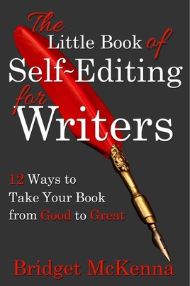
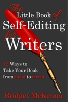
When I updated The Little Book and expanded it to nearly twice its length, I wanted a new cover to bring it to the attention of potential new readers. To that end I studied the covers of best-selling writing books and came up with a design I thought fit into the genre pretty well while also standing out with bold graphic elements and color. To point up the “writing” theme and harmonize with the antique look of the quill pen, I chose Century, a classic text typeface dating back to the 1890s that happily does double duty as display type. Many text faces do not, or at least not successfully. Century is both timeless and versatile.
When I updated The Little Book and expanded it to nearly twice its length, I wanted a new cover to bring it to the attention of potential new readers. To that end I studied the covers of best-selling writing books and came up with a design I thought fit into the genre pretty well while also standing out with bold graphic elements and color. To point up the “writing” theme and harmonize with the antique look of the quill pen, I chose Century, a classic text typeface dating back to the 1890s that happily does double duty as display type. Many text faces do not, or at least not successfully. Century is both timeless and versatile.
I added a few touches of Allura script to echo the red color and curvy shapes of the quill pen. I tried out quite a few lovely script faces before settling on that one for having just enough contrast with Century’s shapes, and being just modern enough to stand out from it while still feeling harmonious.
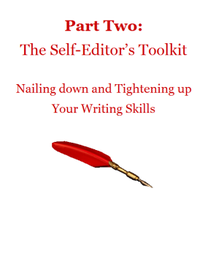
I carried the red into the book’s interior with the headlines and ornaments. The red quill pen re-appears inside as section and chapter break ornaments, and in the color of the Table of Contents links.
I carried the red into the book’s interior with the headlines and ornaments. The red quill pen re-appears inside as section and chapter break ornaments, and in the color of the Table of Contents links.
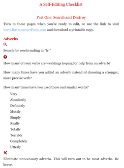
At the back of the book is a quick reference that reiterates the major points of the chapters. Writers can use it to check over a manuscript without having to flip back and forth through the book. Red graphics in the shape of a magnifying glass, a question mark, and tools create quick visual shorthand for “look for this,” “ask yourself this,” and “here's how to fix it.”
The Little Book of Self-Editing for Writers (Revised and Expanded Edition) is available now at Amazon.com, Amazon.co.uk, Amazon.ca, Amazon.com.au, and all Amazon stores for $4.99 or the local equivalent. It will be available soon at Kobo.
The Little Book of Self-Editing for Writers (Revised and Expanded Edition) is available now at Amazon.com, Amazon.co.uk, Amazon.ca, Amazon.com.au, and all Amazon stores for $4.99 or the local equivalent. It will be available soon at Kobo.
 RSS Feed
