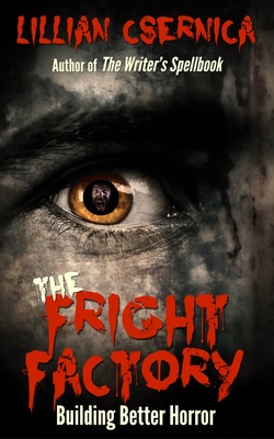
 The Fright Factory by Lillian Csernica
 Earlier this year Sense of Wonder Press released The Writer's Spellbook: Creating Magic Systems for Fantasy, with cover and formatting by Zone 1. Lillian Csernica—whose fiction has appeared in such venues as Weird Tales, 100 Wicked Little Witch Stories, Midnight Movie Creature Feature 2, HORRORS! 365 Scary Stories, and Year's Best Horror Stories XXI—quickly followed that up with a second volume of writing tips: The Fright Factory: Building Better Horror.
The Fright Factory is based on Lillian's horror fiction-oriented columns for Speculations magazine, an excellent publication for writers that ran from 1995-2006. Inside is advice on setting, suspense, monsters good, bad, and otherwise, and lots more useful information for anyone wanting to write effectively in this increasingly popular genre.
Lillian asked me to follow up on my far gentler Writer's Spellbook cover and interior design with something appropriately chilling. Borrowing the type color and positioning to carry over the branding from the Spellbook's cover, my task was to create quite a different atmosphere for this book. After a few rounds of design prototypes, we settled on emphasizing the "fright" aspect with the cover above.
 Blood spatter chapter-ending graphic
 The interior design utilizes blood-splatter illustrations to mark the ends of chapters and graphic chapter headers that match the dominant cover typeface, Nightbird, here combined with the condensed and slightly dramatic sans-serif font League Gothic. It all goes together to create a creepy little package suitable to the book's content and audience (horror writers and the horror-curious) .
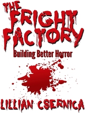 The Fright Factory title page
 The Fright Factory is available from today on Amazon.com, Amazon.co.uk, Amazon.ca, Amazon.com.au, and all Amazon stores, and will appear soon at other e-book outlets. If you're interested in the horror genre, you'll want to check it out.


 RSS Feed
